
Kitchen Cabinet Colors for 2027: 7 Designer-Approved Shades to Know


The all-white kitchen has had a good run. But as we look toward 2027, kitchen cabinet colors are becoming warmer, richer, and a little more adventurous.
Think heritage greens, creamy neutrals, natural walnut, and sophisticated shades of burgundy. The goal isn't to make a kitchen louder. It's to give it character.
At ARTEZIA, we believe the best kitchens balance personal style with materials and finishes that age beautifully. A thoughtfully chosen cabinet color should complement the architecture, work with the surrounding surfaces, and feel just as considered years from now.
So, which kitchen cabinet colors are trending for 2027? Here are seven shades and finishes worth exploring, along with our design recommendations for making them work.
What's Influencing Kitchen Cabinet Color Trends in 2027?
If the latest industry forecasts tell us anything, it's that homeowners are looking beyond predictable finishes and embracing color with depth, warmth, and personality.
In October 2026, Benjamin Moore announced Webster Green HC-130 as its 2027 Color of the Year. The sophisticated green anchors an eight-color palette that includes creamy off-white, golden tan, pale blue, warm brown, and burgundy.
And Benjamin Moore isn't alone. Behr selected Grounded, an earthy olive green, while Sherwin-Williams chose Celery, a softer herbal shade, as their respective 2027 Colors of the Year.
Green, it seems, is having quite the moment. But it's only part of the story. From warm neutrals and rich wood tones to deeper, more expressive shades, 2027 is shaping up to be a year of thoughtful color choices.
Green, it seems, is having quite the moment. But it's not the only shade making waves. Here are seven kitchen cabinet colors and finishes we're watching for 2027.
1. Heritage Green & Earthy Olive: Nature's New Neutral

Green is emerging as one of the defining color families for 2027, and we're not surprised.
From deep heritage greens to subtle olive tones, these shades bring a sense of calm and permanence to the kitchen without feeling overly conservative.
Benjamin Moore's Webster Green HC-130 is a particularly beautiful example. Its classic character feels equally at home in a contemporary kitchen with flat-panel cabinets or a more traditional space with detailed millwork.
For a softer interpretation, Behr's Grounded introduces earthy olive undertones, while Sherwin-Williams' Celery takes the palette in a lighter, fresher direction.
Our design perspective: We love pairing deep green cabinetry with warm walnut, limestone, or travertine. Satin bronze hardware adds warmth without overpowering the composition.
Not ready to go green everywhere? A kitchen island or a bank of tall cabinets is an excellent place to introduce it.
2. Warm Taupe & Earthy Neutrals: The New Quiet Luxury

Gray isn't necessarily gone. It's simply getting warmer.
For 2027, we're seeing a preference for mushroom, taupe, soft beige, and nuanced greige rather than the cooler gray finishes that dominated kitchens for years.
These warmer neutrals create a more inviting atmosphere while maintaining the understated elegance many homeowners love.
Benjamin Moore's Shakespeare Tan 228, part of its 2027 Color Trends Palette, reflects this movement toward golden, earthy undertones.
In contemporary kitchens, warm neutrals are especially effective on large cabinet surfaces. They provide visual continuity without making the space feel sterile or overly minimal.
Our design perspective: Pair taupe cabinetry with lightly veined stone, warm oak, and restrained metal accents. Keeping the materials within a similar color family creates depth through texture rather than contrast.
The result is subtle, sophisticated, and refreshingly easy to live with.
3. Natural Walnut & Warm Wood Tones: Let the Grain Do the Talking

Not every trending kitchen cabinet color comes from a paint swatch.
Sometimes, the most beautiful color is already in the wood.
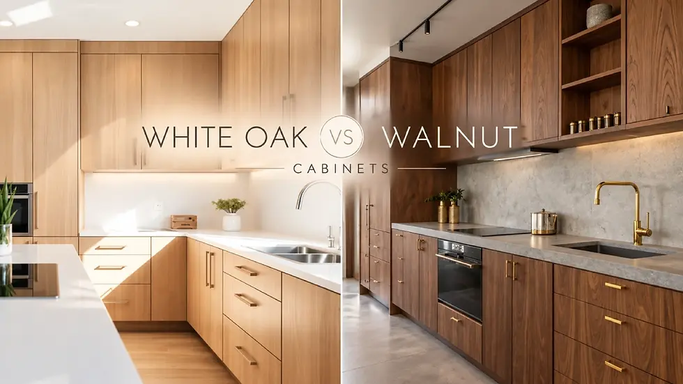
Natural walnut, warm oak, and medium-toned wood veneers are becoming increasingly important in kitchen design. Rather than hiding the grain beneath an opaque finish, these materials celebrate the unique character of wood.
For homeowners considering European kitchen cabinets, natural veneers offer an excellent way to introduce warmth while retaining clean lines and a contemporary appearance.
Walnut brings rich brown tones and distinctive grain variation, while oak can create a lighter, more relaxed atmosphere.
Our design perspective: We particularly like combining natural walnut with matte lacquered cabinetry or light stone surfaces. The contrast feels architectural without being visually busy.
The secret is restraint. When the wood has beautiful character, give it room to shine.
For a closer look at these materials, explore our guide to White Oak vs. Walnut for Custom Cabinetry.
4. Creamy White & Soft Ivory: White, with a Warmer Personality

Before you say goodbye to white kitchens entirely, consider this: white isn't disappearing. It's evolving.
Instead of brilliant, stark whites, warmer variations such as ivory, cream, and soft off-white are becoming increasingly appealing.
Benjamin Moore's White Down OC-131, included in its 2027 palette, is a good example of this direction.
These shades retain the brightness and versatility of white while creating a softer, more welcoming atmosphere.
They're also particularly effective in kitchens with natural wood flooring, textured stone, or warmer architectural finishes.
Our design perspective: The undertone matters more than you might think. A cabinet finish that looks perfectly creamy in a showroom can appear yellow or gray in a different light.
Always evaluate samples alongside your countertop, flooring, and backsplash materials, preferably in both natural and artificial lighting.
A beautiful white kitchen isn't necessarily about choosing the brightest white. It's about finding the right one.
5. Burgundy & Rich Wine Tones: A Little Drama, Beautifully Done

Who says cabinetry has to play it safe?
Burgundy, oxblood, and rich wine-inspired shades bring an unexpected sense of sophistication to contemporary kitchens.
These colors feel especially relevant for 2027, with Benjamin Moore including Townsend Harbor Brown HC-64, a deep burgundy-brown, in its annual Color Trends Palette.
Unlike brighter reds, these muted shades have an earthy quality that makes them easier to integrate with natural materials.
We find them particularly effective in kitchens that need a distinctive focal point.
Our design perspective: Consider burgundy lacquer for a kitchen island, a statement pantry wall, or a carefully defined cabinetry zone.
Pair it with light limestone, warm walnut, or subtle bronze accents to balance the richness.
And remember, a bold cabinet color doesn't have to dominate the entire kitchen. Sometimes, one beautifully executed feature makes the strongest impression.
6. Muted Blue & Deep Navy: A More Refined Kind of Blue

Blue has long been a favorite for kitchen cabinetry, but its 2027 interpretation feels more nuanced.
Rather than bright, highly saturated blues, we're drawn to muted blue-gray, soft mineral tones, and deeper navy finishes.
Benjamin Moore's Nelson Blue CW-635, a delicate pale blue in its 2027 palette, shows the softer side of this color family.
At the other end of the spectrum, deeper navy cabinetry creates a more dramatic architectural presence.
Both can work beautifully, depending on the proportions and natural light available in the space.
Our design perspective: Soft blue cabinetry pairs naturally with pale stone, light oak, and understated brushed metals. For navy, consider lighter countertops and warm wood details to prevent the composition from feeling too heavy.
Blue can be timeless, but the undertone and surrounding materials make all the difference.
7. Espresso & Chocolate Brown: Dark, Warm, and Understated

If black cabinetry feels too stark, dark brown offers an intriguing alternative.
Espresso, chocolate, and deep coffee tones bring richness and contrast while retaining a warmer, more organic character.
They also complement the broader shift toward earthy interiors. Benjamin Moore's Antique Copper 1169, another shade from its 2027 palette, reflects this growing appreciation for sophisticated browns with warm undertones.
For luxury kitchens, darker wood veneers and brown-toned lacquer finishes can introduce depth without relying on an all-black design.
Our design perspective: Espresso cabinetry looks particularly beautiful alongside travertine, beige limestone, or light porcelain surfaces.
We also recommend considering the finish itself. A matte dark-brown lacquer creates a different impression from richly grained stained wood, even when the overall color is similar.
It's proof that dark cabinetry can feel warm, inviting, and quietly luxurious.
How to Pair Kitchen Cabinet Colors with Stone, Wood, and Metal
Choosing a cabinet color is only the beginning.
The most successful kitchens don't treat cabinetry, countertops, backsplashes, and hardware as separate decisions. Every finish contributes to the overall composition.
Here are a few combinations we particularly love:
Cabinet color | Complementary materials | Overall look |
Heritage green | Travertine, walnut, satin bronze | Organic and sophisticated |
Warm taupe | Light marble, warm oak, brushed nickel | Soft and timeless |
Natural walnut | Cream lacquer, light porcelain | Warm contemporary |
Creamy white | Calacatta-style stone, natural oak | Bright and refined |
Burgundy | Light limestone, smoked walnut | Rich and distinctive |
Muted blue | Pale quartzite, light oak | Calm and elegant |
Espresso brown | Beige limestone, bronze accents | Dramatic yet inviting |
Our advice? Start with one material you genuinely love, whether it's a particular wood veneer or a striking piece of natural stone, and build the palette around it.
A successful combination doesn't require everything to match. It requires the colors and materials to belong together.
Two-Tone Kitchen Cabinets: Why Choose Just One?

Can't decide between warm walnut and creamy white? Perhaps you don't have to.
Two-tone kitchen cabinets offer a practical way to introduce contrast, highlight architectural features, and create a more personalized kitchen.
The concept is simple: combine two complementary cabinetry colors or materials within the same space.
For example, natural walnut base cabinets can be paired with soft ivory upper cabinets. A deep green island can become the focal point within an otherwise neutral kitchen. Or floor-to-ceiling cabinetry can feature a different finish from the main preparation area.
In modern European kitchen cabinets, we especially appreciate combinations of textured wood veneer and smooth lacquered surfaces. The difference in texture creates interest even when the colors themselves are relatively subtle.
The key is maintaining balance.
Our design tip: Choose one finish to lead and another to support it. Repeating a material elsewhere in the kitchen, such as wood cabinetry that coordinates with open shelving, helps the entire design feel intentional.
Two-tone doesn't have to mean two competing colors. Often, the most elegant combinations are the quietest.
How to Choose a Kitchen Cabinet Color That Won't Feel Dated
Trends are wonderful for inspiration, but kitchen cabinetry is a long-term investment.
Before settling on a color, we recommend considering three things.
1. Think About the Entire Space
Your cabinetry should relate naturally to the flooring, wall finishes, countertops, and surrounding rooms.
An open-plan kitchen, in particular, benefits from a palette that feels connected to the rest of the home.
2. Pay Attention to Light
Natural and artificial lighting can dramatically influence how colors appear.
Deep green may look almost charcoal in a poorly lit corner, while warm ivory can take on different undertones throughout the day.
Review physical samples in the actual space whenever possible.
3. Choose the Material, Not Just the Color
A cabinet's appearance depends on more than its shade.
Wood grain, lacquer sheen, surface texture, and even door proportions affect how the final design feels.
A matte lacquer and a natural veneer may share similar tones, but they create entirely different experiences.
Most importantly, choose something you genuinely love.
The best kitchen cabinet color isn't necessarily the one appearing most frequently in a trend report. It's the one that complements your home and still brings you pleasure years later.
Create a Kitchen That Feels Timeless with ARTEZIA

Kitchen cabinet colors for 2027 are less about following a formula and more about creating spaces with warmth, character, and individuality.
Whether you're drawn to understated neutrals, rich natural wood, or a beautifully unexpected shade of green, the right combination of materials and finishes can transform how a kitchen looks and feels.
At ARTEZIA, we work with homeowners, architects, and interior designers throughout San Francisco and the Bay Area to create thoughtful, beautifully coordinated cabinetry solutions through our curated European cabinetry offerings.
From the first material selection to the finer design details, we believe exceptional kitchens should feel personal, functional, and effortlessly timeless.
Explore our cabinetry collections or contact ARTEZIA to discuss your upcoming kitchen project.
Frequently Asked Questions About Kitchen Cabinet Colors for 2027
What kitchen cabinet colors are trending for 2027?
The leading color directions include heritage green, earthy olive, warm taupe, natural walnut, creamy white, burgundy, muted blue, and chocolate brown. Benjamin Moore's 2027 Color Trends Palette and the latest kitchen industry forecasts reflect a broader preference for warmth, natural materials, and personalized finishes.
Are white kitchen cabinets still in style for 2027?
Yes. White cabinetry remains a timeless choice, particularly in warmer variations such as ivory, cream, and soft off-white. These shades pair beautifully with natural wood, stone, and textured materials.
Are two-tone kitchen cabinets still popular?
Two-tone kitchen cabinets continue to be a versatile design approach. Combining natural wood with lacquered cabinetry, or using contrasting finishes on the island and perimeter cabinets, adds visual depth while maintaining a cohesive design.
What cabinet colors work best with natural wood?
Warm white, taupe, deep green, muted blue, and burgundy can all complement natural wood cabinetry. The ideal combination depends on the wood species, its undertones, and the overall design style.


Comments